Monday, 16 May 2011
Wednesday, 6 April 2011
EFFECTS IN PREMIERE PRO
We did this by clicking on the audio controls and finding the little orange/yellow markers and moving them up and down to change the volume. We also added audio gain to the clips that werent loud enough..

Poster
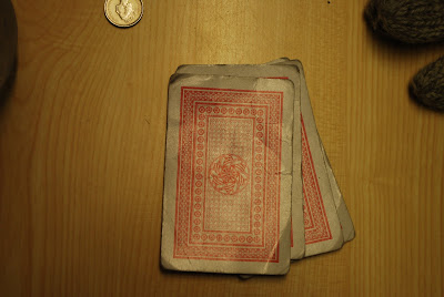
 The magazine goes with the poster as the same font is used in the two peices. the three main characters in the film and the trailer are in the poster as well as the playing cards which make it blatently obvious what kind of genre and what kind of film the audience are in store for. The Critics comments are also very important to our poster as it entices the audience to watch at a cinema, and the fact that the reviews are so high will mean that the standard of film will be high. The star-ratings reinforce this too as it gives an extra crediting to the film. The colours are the same as the colours in the trailer and the magazine: red, gray and black. The title the same as the trailer and the magazine, and since they all linked in we thought this would make the whole coursework look more polished as most films are marketed in this way. The tagline was used since it was perfect to what our film is about. As the storyline is about not losing, and winning from the cardgame and the heist, the tagline undoubtedly shows this.
Magazine cover finished
 With the conventions shown in previous posts this is how we wanted our magazine covers to look.. We went with a nice bold title, and a short cool title at that. There is a slogan for the magazine also "the mystery is for you to see" catchy and relevant to the title of the magazine and relavent to what the magazine is about. We also have a date and price for the issue which adds to authenticity as well as comforming to the marketing standard of a magazine, in a generally visible place on the cover. The barcode is in the bottom left also which is clear to customers. The colours are all very clear with each other. The intergration of grey, black and red all go well together, and strike passers-by as a typical magazine cover. When printed off and placed with other magazine covers, 18/20 people said that the cover looked professional, and the only criticism was that the model was obviously college go-er! since people knew the character on the cover, everyone who liked the magazine cover said that if the character was someone famous or the film was famous itself the cover would be impeccable.
Wednesday, 30 March 2011
Poster Planning


- similar to '21' movie poster, there should be a set of card, or two slanted cards with a picture inside
- a relevance of the diamond flush - being a diamond or a car with diamonds on the cover
- serious faces with most characters on, and Maverick to be centralised
- have some show of violence in the cover, for examples guns or knives, just to reflect that it is an action thriller.
- the poker factor needs to be introduced, whether its by the slanted card idea (the cards being the background so the outline of the cards is visible) or just a show of poker cards and poker chips
- the colours need to relevant to the film, red signifies the colour of the Diamond cards..
- possibly reviews on the poster somewhere or star ratings perhaps
- a date of release
- title obviously Diamond Flush here we can have the same title font as the one used for the magazine cover for Enigma magazine
- we need a certificate for the film, we are expecting all the content to be accountable as a 15 certificate
- the film needs a sassy line, like a review line for example "stylish, clever and funny.. an excellent thriller overflowing with cool" or a slogan..
- actor names in real life
- credited roles in small, thin, fine vague writing at the bottom of the poster
all these will make the poster look authentic which is what we hoped for throughout the filming process..
Wednesday, 16 March 2011
Style of Trailer
http://www.youtube.com/watch?v=h6hZkvrFIj0
with the clips we have captured, a Guy Richie style film and Guy Richie style trailer is perfect for what we wish to do.
with this trailer, at 0.08 into the trailer the character names introduce the characters which is similar to what we will do. We thought we could do this by cutting individual scenes of normal acting and label them or by doin it with a black screen in the background with limited light to show them, it looks a bit more sinister but can give it a darker vibe.
We will be labelling them through specific fonts similar to the fonts from the magazine cover, but also by voice-overs.
in this trailer there is speech in between each significant scene which could also work! The voice-overs will be Gregs job which is perfectly suited to him as he can adapt himself to various voices, accents and tones.
Sin City
http://www.youtube.com/watch?v=YKFLrTYKIXk
Similar to Lock Stock.. we would like the Character Labelling idea, but we may struggle with certain cartoon designs and certain editiorial techniques.
Bronson
http://www.youtube.com/watch?v=icKfEeNxXIk&feature=relmfu
We would like to make it like the Bronson Trailer also, with the scene stops and then the zooming into that image (during the hard hitting beat of the song of choice).
The last few scenes could involve the Reviews and Critics Comments whilst the music stays consistently louder. With this we can gain suspense through the music and imagery rather than speech.
Friday, 11 March 2011
Ideal camera angles
Focus

This camera shot was taken to show less focus on the closer aspects of the picture but more on the money and the person behind, ideal for wider angled shots, like the scene of our trailer where we have a reaction from Maverick.
These types of clips will be used mainly for reactions and very very slow moving shots, focus shots possibly changing so that the focus is drawn from the money to the person.
Angles

These Side angle shots of characters faces and profiles will create a better image to tell what the persons 'poker face' will be.
We thought with this type of scene the angle would come in handy in the general mood of the film but also help us to glamorize the trailer in certain parts, maybe a flush of colour of fast fading of red to look epic, followed by fast moving andf fast editied short scenes.
The mise en scene is almost as if a guardian is on the shoulder of the poker player telling them what to do.
Still-moving shots
 This reaction will be helpful as we can show the emotions of characters in either slow or normal speed
This scene contains real money which will also use in our piece in order to authenticate the overall scheme of things, we will also authenticate the film by use of a real vault and the driving of a car in the 'wheel spin' scenes'.
POV shots

The shots really do make it special. When using a Point Of View shot we can see what that person has in their hand as well what others are competing against..
With other characters we can tell how nervous or confident they are if they have twitchy hands or habits with with their hands.
Aswell as card holding scenes we have scenes where we are running and they camera is held in a point of view position so that the audience sees what we see.
Full Body Shots

As the film is about Poker the film would expectadley be filmed with characters behind a table, therefore we use more full body shots to fill that void and make it less monotonous.
I personally get chills when a character gets angry, for instance Gerard Butler in 300 (the iconic scene of "This Is Sparta!!") and when seeing the anger through shouting large movements and full bodied, wide camera angle clips, this inhabits a sense of that goosbumpy escence.

Down Angles/Superior Angles
 The Birds eye view style of filming always looks good, particualrly when scanning round the table to see everyones hands..
High Angle

High Angle Shots are used for power images, for Chase when getting out his chair or whenever he needs to move or go somewhere, the face augments to the power he entails in each scene.
Wednesday, 9 March 2011
Scene list
1) people round the table - camera rolling round the edge of the table
2) downwards angle of the table
3) conversation between Chase and Maverick
4) running scene
5) throwing cards down on the table, and standing up to move away from the table
6) slow motion maverick standing up
7) Chase shouting, where the fuck are they???
8) wheel spin from a car
9) strip scene from a girl character
10) scene full of money, wrapped in a rubber band
11) puttin cufflinks on,
-poppin ya collar
-buttoning up shirts
-pushin tie up to a knot
12) scene with a gun
13) two characters grappling with each other
14) dealer dealing hands out slowly
15) two men in balaclava, one looking behind standing still whilst other one walks forward, and then he turns round and walks forward
16) news scene, 'there has been a heist at local casino..'
Final Scene Ideas
Greg walks intop scene labels Manion
Joe walks into scene labels Riggy
Charles labels Maverick and so on
Then BOOOMMM!!!! "Diamond Flush... in cinemas august 29th"
Sunday, 20 February 2011
Cover done!
Magazine Ideas and Influences

Magazine cover - Fonts
- the arrow which helped us to move objects and adjust them as we needed.
- the brush which we used to obviously paint and fill in certain areas
- the healing brush, got rid of any impurities especially the floor of the studio which was filled with unattractive marks and lines
- the blur tool helped other areas that didnt blend in to look more authentic and real
- drop shadow
- outer glow
- colour overlay
Using Photoshoperino for the Magazine
In our Photoshop experience we used a utter variety of skills, techniques, editorial features and other complexities in order to complete our dront cover. After using this software for the first time we are much wiser on how to complete our piece. It has been hard and somewhat frustrating but we have done it and feel a lot more comfortable using Photoshop.
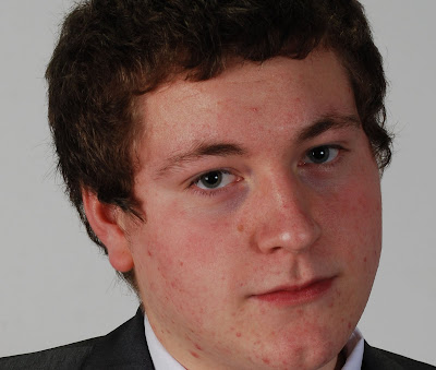
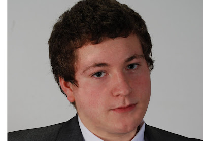
With the practising process at hand, we worked out how to use the healing brush and the spot healing brush, which is something that came in handy when some of our characters have features that could be omitted. With the picture of one of our members being slightly 'spotty', we used this feature and reduced the amount of blemishes to look more natural.
Before

After

Monday, 14 February 2011
Photoshoot magazine covaaa

Friday, 11 February 2011
Photoshoot
DVD Case
Front
- The DVD cover will have the 3 of us holding some money or some diamonds, in our hands leaning towards the camera, bodies turned to one side, maybe even Maverick as the centered front man, with Riggy and Manion to the left and right of him. This Picture would also be effective in a magazine..
- Another thought is to use the Ace Of Daimonds as the main picture, possibley the King of Diamonds slanted behind it to represent the diamond flush. another though is to use a real diamond as the diamond on the cards which we could do by importing a picture into photoshop and merging it onto the card there..
- another idea could be that the picture on the front is of an Ace of diamonds but where the diamond is normally positioned on the card would be where the hands of Maverick are, so it seems like Maverick is holding the ace of Diamond

Back
- with the back of the cover we could have a picture of chase, also with the theme of the cards, possibley the rear side of the cards. and with the idea of using the hand holding them we could have the back of the hand.
- we could also have a picture of the High Straight gang outdoors with a pink/red colour through the picture as well, like the colour of the back of the card, maybe the people are blacked out so they have the sin city effect of dual colour effects where the people are one single colour whilst the background is another colour, so obviously white/balck people with a red background


Thursday, 10 February 2011
EL MUSICO DE PUENO PELI ROJO
this reflects the genre, which is supposed to be a cool, glamorized genre for teenage audiences and above.
our ideas are to use either Kings of Leon - No money because it starts quite slow and eventually builds up after 32 beats, which is key for our trailer as the 4th scene is the clip that changes from the rest in terms of speed and editing. The title itself is relevant to the film and therefore the trailer. The lyrics could also be interpreted so that the theme of the song is also correlated to the trailer, being that he is desperate for something but he cant get it because he has no money, whcih could be like Maverick wanting his brother back, obviously he hasnt got the 'money' (the ability) to get him back, or perhaps the idea could be that he just needs the money, hes sick of being a low life without his brother!
"Won't you give me something I need
Won't you peel me off the street
Gonna wet my tongue
Spit me up and break me a fever
Give me something I can believe in
Give me something to walk me away
I'm a wasting time
And all in all a waste of a living
Waste of a living
Can't you see me walking alone
I've been down to the horns and back
And I'm way to tired
Of blowing out on a burning candle
I got no money but I want you so
I got no money but I want you so oh
I've got so much I cannot handle
Cannot handle
I cannot handle
We are all just pissing around
Cutting loose in this fucking town
I aint coming back
I've got my tick, onto the next one
I got no money but I want you so
I got no money but I want you so oh
And I want, and I want, and I want, and I want ya"
http://www.youtube.com/watch?v=dquvPqWrGNo
ACDC - Big Gun is a song that we thought may have a better impact on the audience as its much more hard-hitting, similar to first song idea but much 'cooler'. similar to the trailer for Last Action Hero and for Iron Man (Iron Man 1+2 having Shoot To Thrill and Highway To Hell)
they both emmit some sort of 'coolness' or a feelin of wow! we thought this might sound really good with our trailer also. the lyrics do also connect to what will be shown on screen too with the reference to a 'Bad Man'
"Riot on the radio, pictures on the TV
Invader man take what he can, shootout on the silver screen
Stickin' 'em up and knocking them down, living out a fantasy
There's a bad man cruising around in a big black limousine
Don't let it be wrong, don't let it be right
Get in his way, you're dead in his sights
Big gun
Big gun
Number one
Big gun
Big gun kick the hell out of you
Terminators, Uzi makers, shootin' up Hollywood
Snakes alive with a forty-five, getting off and doing no good.
If you ain't wise, they'll cannibalise, tear flesh off you
Classified, lady killers, prayin' in the human zoo
They saddle you up and take you to town
Better look out, when he come around
Big gun
Big gun
Number one
Big gun"
http://www.youtube.com/watch?v=ZTuPm2SMOd8
Because of the sound both songs produce, the treble and distortion bring a gritty escense to the trailer, making it both authentic and exciting.
Wednesday, 9 February 2011
Characters as a Unit

As a group the High straight will look more executive, suited to the actual role and the way they will be playing, particularly for the team that will be stealing from the vault to look less conspicuous!
Monday, 7 February 2011
Characters continued...
Chase
Being the bad-guy and attaining the typical characteristics of a bad-guy, he is a very evil and manipulative man. obviously killing Mavericks brother (Marco) he shows his ability to manipulate his 'executive games' that he plays in.
we thought by creating a mean, arogant and forceful character we would need to think properly what he would have to wear and how he would need to act. We decided that these pictures reflect his personality and image...
Obidiah Stane (Iron Man)

Mr Smith (Matrix)

Characters

Being the last character of the gang Manion is the 'hard man of the group' used to infiltrate Elite casino. He doesnt have the brains, but he definitley has the braun, Jason Statham is an idea we agreed on so that we could keep that gritty British bad boy image, from films such as Transporter trilogy and so on..
QUESTIONIARE FOOOOLLS!

We made a questionaire in order to get opinions of our idea. After asking 50 different people about, varient in age and gender, we got the following results for our questions..
we found this very helpful as it has built our confidence for the idea but will also give us an insight into what audiences will be appealed to, affecting the direction and input to production
Friday, 4 February 2011
Plot
With the plot now being constructed, the idea is to converge the idea of Oceans 11, with the true grit of Casino Royale, but also to have a hint of Rain Man aswell
The 'Scheming' throughout all the films is an essential element within our trailer, we need to have the action of Casino Royale and Oceans 11, although with introduction of an intelligent character we can use this to our advantage to build on our original idea...
THE PLOT
Two brothers (Maverick and Marco) both stolen from luck, decide to get back at the totalitarian force that is the owner of 'ELITE CASINO' named Chase.. the two brothers originally won an executive game of Texas Hold 'em years before but due to the power and authority of Chase they we're declined access to thier winnings and Marco was killed.
Thier plan is to offer a game of texas hold 'em to Chase where the DIAMOND FLUSH is the best hand. With this in mind they try hire a team to steal from 'the vault' at the same time so that they are guaranteed either money, or diamonds.


