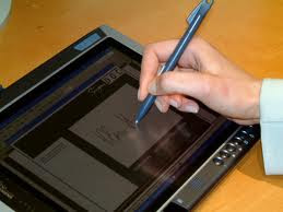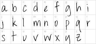
The next suggestions was to use an online animator but as you can see from the results below, it produced the same effect as the handwriting graphic tablet. I decided to use photoshop to create the names and turn the images into an animation.
For the actors names I decided to use a simple font that looked handwritten to link back to the high school theme. The font i used was called 'Throw your hands up in the air'... 
To create the animation I had to make the titles in photoshop and rasterise the text layers to transform them into photo layers, which i could use different tools on. I used the rubber tool to rub out small parts of the text from the last letter to the first, saving each photo as I went along(around 200 photos per title). I had to rub it out in the reverse order that it would be written so that when I reversed it in premier, it would have the written effect. I exported the PSD documents as an AVI animation and opened it up in premier and reversed it. When I consulted the group, we all agreed that the animations took too long and slowed down the face pace of the piece so I increased the duration until I had the correct speed.
I wanted to try this with the main title also but the 'varsity' font made it difficult due to the stoke around the text. Instead I used layers where one letter appeared at a time, as if the title was being typed. I think this would work really well with sound effects but I need a song that will also work underneath it.
The animation on the fonts was well recieved by people who viewed the work in the early stages. I also thought it would add to the professional look of the piece if I created a 'production' video at the start. I still wanted to keep it looking 'young' to suit the target audience so I used a moving animation with brightly coloured paint splashed backgrounds and the production companies 'name' appearing on screen. I created a gif of this to upload to the blog...

Lucinda

To create the animation I had to make the titles in photoshop and rasterise the text layers to transform them into photo layers, which i could use different tools on. I used the rubber tool to rub out small parts of the text from the last letter to the first, saving each photo as I went along(around 200 photos per title). I had to rub it out in the reverse order that it would be written so that when I reversed it in premier, it would have the written effect. I exported the PSD documents as an AVI animation and opened it up in premier and reversed it. When I consulted the group, we all agreed that the animations took too long and slowed down the face pace of the piece so I increased the duration until I had the correct speed.
I wanted to try this with the main title also but the 'varsity' font made it difficult due to the stoke around the text. Instead I used layers where one letter appeared at a time, as if the title was being typed. I think this would work really well with sound effects but I need a song that will also work underneath it.
The animation on the fonts was well recieved by people who viewed the work in the early stages. I also thought it would add to the professional look of the piece if I created a 'production' video at the start. I still wanted to keep it looking 'young' to suit the target audience so I used a moving animation with brightly coloured paint splashed backgrounds and the production companies 'name' appearing on screen. I created a gif of this to upload to the blog...
Lucinda
0 comments:
Post a Comment