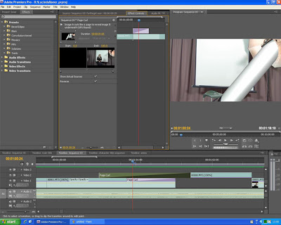
I had to make the clips longer as the effect cut of part of them and overlap them using the different layer channels.
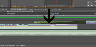
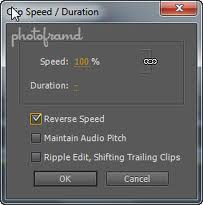
I also had to put the effect in reverse to make it look like the page was turning from right to left, the way you would literally turn a page.
This effect worked well as it added to the yearbook effect which linked to the school theme.
I also created a synthetic photography flash between some of the shots to add to the idea of it being a photoday.
At first, I used Adobe After Effects to add the flash after following an online tutorial but once I had put the flash on, I could move it too a different section. By using a white matte in Premiere, changing the duration to 10 frames (00;00;00;10) and setting the opacity at the end of the 'flash' to 0% I created a flash effect and was able to move the white matte clip around to where ever I needed it and duplicate it where necessary.
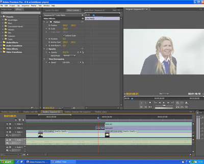
For the actual titles I had three video layers playing; the backdrop of the photoshoot, a still from the photoshoot and the previously animated titles.
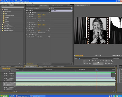
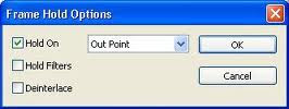
For the back drop, I used a section of filming that was recorded just before one of the actors walked on screen. To make it the necessary length I held the clip from the in point so it was froze and i could adjust the length with no changes to the scene.
 My first idea was to keep with background in colour and layer a black and white school photo over the top for each character. However, i found the two didn't juxtapose enough to create a big effect as the colours in the backdrop where quite unsaturated. I tried to change the saturation levels to enhance the juxtaposition between the colour and the black and white but then the background clip looked odd against the other clips which where quite pale.
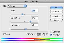
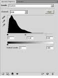
Also, increasing the saturation level on the other clips created unnatural skin tone on the actors so I decided to put both in black and white and simply increase the contrast.
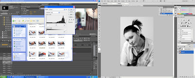
It had a more dramatic effect and worked well with the white animated text with a black stroke.
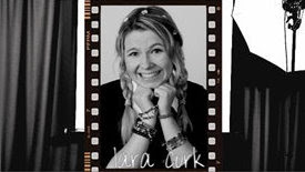
When people gave me feedback on the video, they thought the slight colour scene change on some of the scenes was quite noticable and made it look less professional. This was due to the need to keep changing the lighting on set as I also needed to do a photoshoot for each character when they were still in costume. I rectified this using the colour change effect, balancing the levels of saturaion and hue, contrast and light levels in each scene to match the rest. Afterward, the viewers thought it was dramatically improved by this simple change.
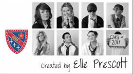
After further research of other title sequences, I found a title for the creator was often included. I created another handwritten title animation but I wanted to add it to the year book page which was also a photoshop document. I created the original image using a high definition 'paper' that was created for use in Premiere to get the correct size for the screen and began creating the title images. After following the same procedure as before, I imported the clip as an AVI and added it to the end of my video. It gave the video more of a definite finishing point.
Lucinda.
0 comments:
Post a Comment